Light and dark modes are color
schemes most commonly used for text, background, GUI (graphical user interface)
elements, and web design. Modern devices like computers, cell phones, and
tablets offer users the choice of light mode or dark mode. The concept is
called contrast polarity. This is the difference between the text color and the
background colors.
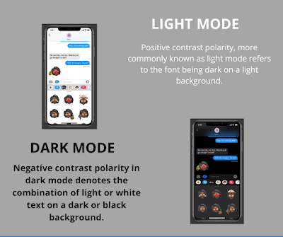
Positive contrast polarity, more commonly known as
light mode refers to the font being dark on a light background.
Negative contrast polarity in dark mode denotes the
combination of light or white text on a dark or black background.
Pros and cons of dark mode:
Pros:
• Longer battery life
• Reduce blue light exposure
• Reduce glare
• Decrease in eyestrain in low light conditions
Cons:
• In bright light, text appears washed out
• Long pieces of context or text are more challenging
to read
• Prolonged use of dark mode can cause discomfort when using a device in light mode
Pros and cons of light mode:
Pros:
• Better for visual acuity tasks
• Smaller fonts are easier to see
• There is more overall light so the people contracts
more
Cons:
• Long-term costs associated with myopia
• Hard to read for people with cloudy ocular media
As you can see there are pros and cons to each mode. The debate about which interface to use or which is better will continue. It is best to use common sense when deciding.
- If a particular mode causes discomfort, change it!
- Use the 20-20-20 rule.
- See your eyecare professional if you find you have problems with your vision in any mode.
Sources:
#eyegotcha
#PittsburghEyeCare
#PittsburghOptometrist


No comments:
Post a Comment